Typography is everywhere—shaping emotions, influencing perceptions, and defining brand identities. Yet, few truly understand its power. “The Ultimate Guide to Mastering Typography in Design” unlocks the secrets behind font psychology, classification, and technical precision. Whether you’re a designer, marketer, or creative professional, this book equips you with the tools to choose fonts with confidence, enhance readability, and create stunning, impactful designs.
Ready to take your typography game to the next level? Stay ahead of the trends while mastering timeless design principles.
#Typography #DesignSkills #GraphicDesign #FontMastery

Have you ever stopped to consider the power that fonts hold over our perceptions? From the moment you wake up and check your phone to the last advertisement you see before bed, typography surrounds us, silently influencing our thoughts and emotions. It’s an art form that goes largely unnoticed by the untrained eye, yet it shapes our world in profound ways. Welcome to “The Ultimate Guide to Mastering Typography in Design,” a comprehensive guide that will transform the way you see and interact with the written word.
Typography, the art and technique of arranging type, has a rich history dating back to the invention of movable type in the 15th century. Since then, it has evolved into a crucial element of design, marketing, and communication. In today’s digital age, where visual content reigns supreme, understanding typography has become more important than ever. This book delves into the fascinating world of fonts, exploring their psychological impact, historical significance, and practical applications in modern design.
As an experienced designer and typographer, I’ve witnessed firsthand the transformative power of well-chosen fonts. Through years of study and practice, I’ve uncovered the hidden language of typography – a language that speaks directly to our subconscious, evoking emotions and shaping perceptions without us even realizing it. In this book, I’ll share my insights and expertise, guiding you through the intricacies of font selection and typography design with a fresh perspective that combines traditional wisdom with cutting-edge trends.
Partner Boost
<a target="_blank" href="https://click.linksynergy.com/fs-bin/click?id=%2aixK2Qutfa4&offerid=1817204.4&type=3&subid=0">Partner Boost</a><img border="0" width="1" alt="" height="1" src="https://ad.linksynergy.com/fs-bin/show?id=%2aixK2Qutfa4&bids=1817204.4&type=3&subid=0">Throughout these pages, we’ll explore several key themes that are essential to mastering typography. First, we’ll delve into the psychology of fonts, examining how different typefaces can evoke specific emotions and influence the way we perceive information. You’ll learn how to harness this power to create designs that resonate with your target audience on a deeper level.
Next, we’ll unravel the complexities of font classification, from the elegant serifs to the clean, modern sans-serifs, and everything in between. You’ll gain a comprehensive understanding of the various font families and their unique characteristics, enabling you to make informed decisions when selecting typefaces for your projects.
We’ll also explore the technical aspects of typography, including the crucial elements of leading, kerning, and alignment. These often-overlooked details can make or break a design, and mastering them will elevate your work from amateur to professional. Through practical examples and exercises, you’ll learn how to fine-tune these elements to create visually stunning and highly readable designs.
Another key theme we’ll address is the evolution of typography in the digital age. From the limitations of early computer fonts to the vast array of options available today, we’ll trace the journey of typography and examine how technological advancements have shaped the field. This historical context will provide you with a deeper appreciation for the art form and inspire you to push the boundaries of what’s possible in your own designs.
Lastly, we’ll explore current typography trends and how to incorporate them into your work without sacrificing timeless design principles. You’ll learn how to strike the perfect balance between staying current and creating designs that will stand the test of time.

This book is designed for a wide range of readers, from aspiring designers looking to build a strong foundation in typography to seasoned professionals seeking to refine their skills and stay ahead of the curve. Whether you’re a graphic designer, web developer, marketing professional, or simply someone with a keen interest in visual communication, you’ll find valuable insights and practical advice that you can immediately apply to your work.
For beginners, this book serves as a comprehensive introduction to the world of typography. You’ll learn the fundamental concepts and terminology, gaining the confidence to discuss and implement typographic principles in your projects. By the end of the book, you’ll have a solid grasp of font selection, pairing, and arrangement, allowing you to create visually appealing and effective designs.
For experienced designers, this book offers a fresh perspective on typography, challenging you to reconsider your approach and pushing you to new heights of creativity. You’ll discover advanced techniques for manipulating type, learn about the latest trends in the field, and gain insights into the psychological aspects of font choice that can give your designs an extra edge.
Marketing professionals and business owners will find this book invaluable in understanding how typography can impact brand perception and consumer behavior. You’ll learn how to choose fonts that align with your brand identity and effectively communicate your message to your target audience. This knowledge will empower you to make informed decisions about your visual branding and marketing materials, ultimately leading to stronger connections with your customers.
Web developers and UX designers will benefit from the sections on typography for digital platforms. You’ll learn how to optimize fonts for on-screen reading, ensure accessibility, and create responsive designs that look great on any device. This knowledge is crucial in today’s mobile-first world, where user experience can make or break a website or application.

By the time you finish this book, you’ll have gained a wealth of knowledge and practical skills that will transform your approach to design. You’ll be able to analyze and critique typography with a discerning eye, make confident font choices that enhance your message, and create designs that are not only visually stunning but also effective in achieving their intended purpose.
You’ll develop a deeper appreciation for the nuances of different typefaces and understand how to use them to evoke specific emotions or convey particular messages. This heightened awareness will allow you to communicate more effectively through your designs, whether you’re creating a corporate annual report, a wedding invitation, or a mobile app interface.
Moreover, you’ll gain the ability to see typography as more than just a functional element of design. You’ll understand its power as a form of visual rhetoric, capable of persuading, informing, and inspiring. This perspective will open up new creative possibilities in your work, allowing you to push the boundaries of traditional design and create truly innovative solutions.
For those interested in the business side of design, this book will equip you with the knowledge to make strategic decisions about typography that can impact your bottom line. You’ll learn how to choose fonts that enhance readability, improve user experience, and strengthen brand recognition – all factors that can contribute to the success of a product or service.
Perhaps most importantly, you’ll develop a newfound confidence in your design skills. Armed with a deep understanding of typography principles and practices, you’ll be able to justify your design choices to clients or colleagues, articulate your creative vision more effectively, and approach each project with a clear strategy for success.
As we embark on this typographic journey together, prepare to see the world around you with new eyes. The fonts that once blended into the background will suddenly come alive, each with its own personality and story to tell. You’ll find yourself noticing the subtle differences between similar typefaces, appreciating the craftsmanship behind well-designed fonts, and perhaps even developing strong opinions about the proper use of Comic Sans.
Get ready to unlock the secrets of font choice and take your design skills to the next level. Whether you’re looking to create more impactful designs, build stronger brands, or simply satisfy your curiosity about the hidden language of typography, this book will be your guide. So, grab your favorite pen (or keyboard), settle into a comfortable spot, and let’s dive into the fascinating world of fonts. Your journey to typographic mastery starts now.
As we turn the page to the first chapter, remember that typography is both an art and a science. It requires creativity and intuition, but also precision and technical knowledge. Throughout this book, we’ll balance these aspects, providing you with the tools to express your artistic vision while adhering to time-tested principles of good design.
We’ll start by exploring the fundamental question: What is typography? This seemingly simple query opens up a world of history, theory, and practice that forms the foundation of all typographic work. We’ll trace the evolution of typography from its roots in ancient cave paintings and early writing systems to the digital fonts we use today. This historical context will give you a deeper appreciation for the craft and help you understand why certain conventions exist in modern typography.

As we delve deeper into the psychology of fonts, you’ll discover how different typefaces can evoke specific emotions and associations. We’ll examine case studies of successful (and not-so-successful) font choices in branding and advertising, analyzing how typography affects consumer perception and behavior. This knowledge will be invaluable as you learn to choose fonts that not only look good but also effectively communicate your intended message.
We’ll then explore the subtle but crucial differences between typography, lettering, typefaces, and fonts. Understanding these distinctions will allow you to communicate more precisely about your work and make more informed decisions in your design process. You’ll learn about the various elements that make up a typeface, from the anatomy of individual letters to the overall style and mood of a font family.
One of the most practical skills you’ll develop is the ability to choose the perfect font for any project. We’ll walk through a step-by-step process for font selection, considering factors such as brand personality, target audience, medium, and context. You’ll learn how to create harmonious font pairings and when to use contrasting styles for maximum impact.
The age-old debate between serif and sans-serif fonts will be thoroughly examined, with a balanced look at the strengths and weaknesses of each. You’ll learn when to use each style and how to combine them effectively. We’ll also explore the full spectrum of font classifications, from elegant scripts to playful display fonts, giving you a comprehensive understanding of the typographic toolkit at your disposal.
Technical aspects of typography, such as alignment, leading, and kerning, will be demystified. You’ll learn how these subtle adjustments can dramatically improve the readability and aesthetic appeal of your designs. Through hands-on exercises, you’ll develop an eye for these details and the skills to fine-tune your typography like a pro.

As we explore current typography trends, you’ll gain insights into how the field is evolving and how you can incorporate cutting-edge techniques into your work. We’ll also discuss timeless principles of typography that remain relevant regardless of passing fads, helping you create designs that are both contemporary and enduring.
Throughout the book, we’ll challenge common misconceptions about typography. You’ll learn why Comic Sans isn’t always the villain it’s made out to be and discover situations where “ugly” fonts can be surprisingly effective. These discussions will encourage you to think critically about established design rules and develop your own informed perspective on typography.
For those new to the field, we’ll provide a comprehensive crash course in typography terminology. By the end of the book, you’ll be able to discuss kerning, ligatures, and baseline grids with confidence. This vocabulary will not only enhance your understanding of typography but also allow you to communicate more effectively with other designers and clients.
We’ll also address common typography mistakes and provide practical solutions for fixing them. These insights will help you avoid pitfalls in your own work and develop a more critical eye when evaluating designs.
As we near the end of our journey, we’ll look to the future of typography, exploring how emerging technologies like variable fonts and artificial intelligence are shaping the field. You’ll gain a glimpse into the exciting possibilities that lie ahead and how you can position yourself at the forefront of typographic innovation.
Finally, we’ll wrap up with wisdom from design legends who have mastered the art of typography. Their insights and experiences will inspire you to continue honing your skills and pushing the boundaries of what’s possible with type.
By the time you reach the final page of this book, you’ll have gained a comprehensive understanding of typography that spans history, theory, and practice. You’ll be equipped with the knowledge and skills to approach any design challenge with confidence, knowing that you have the power to choose and manipulate fonts in ways that capture attention, convey meaning, and create lasting impact.
So, are you ready to unlock the secrets of font choice and boost your design skills? Turn the page, and let’s begin our typographic adventure. The world of fonts awaits, full of endless possibilities and hidden meanings. It’s time to see typography in a whole new light and harness its power to transform your designs from ordinary to extraordinary. Let’s embark on this journey together, and discover the magic that happens when letters become more than just symbols on a page – when they become a powerful tool for communication, expression, and visual delight.
1- Introduction: What is Typography?


A. Definition and Importance in Design
Typography refers to the art and technique of arranging type to make written language legible, readable, and visually appealing. It encompasses various elements, including font selection, size, line spacing, letter spacing, and alignment. Typography is not merely about choosing a font; it is about creating a visual hierarchy that guides the reader’s eye and enhances the overall message.
The importance of typography in design cannot be overstated. It plays a crucial role in establishing brand identity, conveying emotions, and influencing user experience. For instance, a bold, sans-serif font may evoke a sense of modernity and strength, while a delicate, serif font can suggest tradition and elegance. The right typography can make a significant difference in how a message is perceived.
In my experience as a designer, I have often seen how typography can transform a project. A well-chosen typeface can elevate a simple flyer into a compelling piece of communication. Conversely, poor typography can distract from the message and leave a negative impression. This highlights the need for careful consideration in typography choices, as they can significantly impact the effectiveness of design.
B. Overview of How Typography Shapes Visual Communication
Typography shapes visual communication by influencing how information is presented and understood. It serves as a bridge between the content and the audience, guiding them through the material in a way that is both engaging and informative. Here are some key ways typography achieves this:
Establishing Hierarchy: Typography helps to create a visual hierarchy that directs the reader’s attention. By varying font sizes, weights, and styles, designers can indicate which information is most important. For example, headlines are typically larger and bolder than body text, signaling to the reader where to focus first.


Enhancing Readability: The choice of typeface and its arrangement can significantly affect readability. A clean, well-spaced font allows readers to absorb information quickly, while cramped or overly decorative fonts can hinder comprehension. In my own projects, I have found that prioritizing readability often leads to better engagement and retention of information.
Conveying Tone and Emotion: Different typefaces evoke different feelings. For instance, a playful font may be suitable for a children’s book, while a sleek, modern font might be more appropriate for a tech company. This emotional connection can enhance the overall message and resonate with the audience on a deeper level.
Creating Brand Identity: Typography is a vital component of brand identity. Consistent use of specific fonts can help establish a brand’s personality and make it more recognizable. For example, companies like Coca-Cola and Google have distinct typographic styles that are instantly identifiable, reinforcing their brand image.
Typography is the voice of the written word; it speaks volumes about the message being conveyed.
2- The Psychology of Fonts: How Typography Affects Perception

- Emotional and psychological impact of fonts
- How font choices influence user trust and engagement
The Emotional and Psychological Impact of Fonts
The Hidden Power of Typography
In the vast world of design, typography stands as a silent yet powerful communicator. While many may overlook the significance of font choices, the reality is that typography plays a crucial role in shaping our emotional responses and psychological perceptions. This chapter delves into the intricate relationship between fonts and human psychology, exploring how different typefaces can evoke specific emotions, influence behavior, and ultimately impact the way we interact with visual information.
The Psychology Behind Font Perception

The Subconscious Impact of Fonts
When we encounter text, our brains process not only the literal meaning of the words but also the visual characteristics of the typeface. This subconscious evaluation occurs in milliseconds, yet it significantly influences our interpretation and emotional response to the content. Understanding this psychological phenomenon is crucial for designers aiming to create impactful and effective visual communications.
Font Personalities and Emotional Associations
Just as humans have distinct personalities, fonts too carry their own unique characteristics and emotional associations. These “font personalities” can range from serious and authoritative to playful and whimsical. By understanding these associations, designers can strategically choose typefaces that align with their intended message and evoke the desired emotional response from their audience.
The Emotional Spectrum of Fonts
Serif Fonts: Tradition, Reliability, and Authority
Serif fonts, characterized by their small decorative lines at the end of letter strokes, often evoke feelings of tradition, reliability, and authority. These typefaces are frequently used in print media, academic publications, and formal communications due to their association with credibility and professionalism.
Case Study: The New York Times’ use of the serif font “Times New Roman” reinforces its image as a reputable and authoritative news source, subconsciously influencing readers to trust the content.
Sans-Serif Fonts: Modernity, Clarity, and Approachability
Sans-serif fonts, lacking the decorative lines of their serif counterparts, are often perceived as modern, clean, and approachable. These typefaces are popular in digital interfaces and contemporary designs, conveying a sense of simplicity and efficiency.
Example: Google’s use of the sans-serif font “Roboto” across its products contributes to the company’s image as an innovative and user-friendly tech giant.


Script Fonts: Elegance, Creativity, and Personality
Script fonts, mimicking handwriting or calligraphy, evoke emotions of elegance, creativity, and personal touch. These typefaces are often employed in branding for luxury products, wedding invitations, or designs aiming to convey a sense of uniqueness and artistry.
Anecdote: The iconic Coca-Cola logo, written in a distinctive script font, has become synonymous with happiness and celebration, demonstrating the emotional power of a well-chosen script typeface.
Display Fonts: Attention-Grabbing and Expressive
Display fonts, designed for use in large sizes, are attention-grabbing and highly expressive. These typefaces can evoke a wide range of emotions, from excitement and energy to nostalgia or even unease, depending on their design.
Example: Movie posters often utilize bold, custom display fonts to create instant emotional associations with the film’s genre and tone, whether it’s a horror movie with an unsettling typeface or a comedy with a playful, bouncy font.
The Role of Font Weight and Style in Emotional Impact
Bold: Strength, Confidence, and Emphasis
Bold typefaces convey strength, confidence, and importance. They draw attention and create a sense of urgency or significance. However, overuse of bold text can lead to visual fatigue and diminish its impact.
Italic: Emphasis, Movement, and Sophistication
Italic fonts add emphasis, suggest movement, and can convey a sense of sophistication or thoughtfulness. They’re often used to highlight quotes, foreign words, or to add a touch of elegance to designs.
Light: Delicacy, Modernity, and Sophistication
Light font weights can evoke feelings of delicacy, modernity, and sophistication. They’re often used in high-end fashion branding or minimalist designs to create a sense of refinement and exclusivity.
Cultural and Contextual Factors in Font Perception
The Influence of Cultural Background
It’s crucial to recognize that font perceptions can vary significantly across different cultures. What may be perceived as formal and professional in one culture might be seen as outdated or inappropriate in another.
Case Study: The perception of the font “Comic Sans” varies greatly between cultures. While it’s often criticized in Western design circles, it remains popular in some Asian countries for its perceived friendliness and approachability.
The Impact of Context on Font Interpretation
The emotional impact of a font can also be heavily influenced by its context. The same typeface might evoke different feelings when used in different settings or alongside different visual elements.
Example: A serif font used in a law firm’s branding might convey trust and professionalism, while the same font used in a children’s book could feel stuffy or unapproachable.
The Science Behind Font Psychology
Legibility and Cognitive Fluency

The ease with which a font can be read, known as legibility, plays a significant role in its emotional impact. Fonts that are easily legible create a sense of cognitive fluency, leading to positive emotional associations and increased trust in the content.
Research Insight: A study published in the Journal of Consumer Research found that when information is presented in a font that is easy to read, people are more likely to engage with the content and view it favorably.
The Impact of Font on Memory and Learning
The choice of font can also influence how well information is remembered and processed. Fonts that require slightly more effort to read can, in some cases, lead to better retention of information.
Study Reference: A 2010 study by Princeton University found that students retained more information when studying materials printed in less legible fonts, suggesting that the increased cognitive processing required led to deeper engagement with the content.
Practical Applications of Font Psychology in Design
Branding and Logo Design
Understanding the emotional impact of fonts is crucial in branding and logo design. The chosen typeface becomes a visual representation of the brand’s personality and values, influencing how consumers perceive and interact with the brand.
Case Study: The evolution of Airbnb’s logo and typography from a script font to a custom-designed sans-serif typeface reflects the company’s transition from a quirky startup to a global hospitality brand, emphasizing simplicity, universality, and belonging.
User Interface (UI) Design
In UI design, font choices can significantly impact user experience, influencing factors such as readability, navigability, and overall satisfaction with the interface.
Example: Apple’s use of the San Francisco font across its devices and interfaces contributes to a cohesive, user-friendly experience, with the font’s clean lines and balanced proportions enhancing readability and visual appeal.
Advertising and Marketing Materials
In advertising, the psychological impact of fonts can be leveraged to create more persuasive and emotionally resonant messages.
Anecdote: A study conducted by marketing agency Siege Media found that using a serif font in article headlines led to a 21% increase in click-through rates compared to sans-serif fonts, highlighting the potential impact of font choices on user engagement.
Packaging Design
The typography used in packaging design plays a crucial role in communicating product attributes and evoking desired emotional responses from consumers.
Example: Luxury chocolate brands often use elegant script or serif fonts on their packaging to convey a sense of indulgence and sophistication, while organic food products might opt for hand-drawn or rustic typefaces to emphasize naturalness and authenticity.
The Future of Font Psychology in Design
The Impact of Variable Fonts
The emergence of variable fonts, which allow for dynamic adjustments in weight, width, and other attributes, opens up new possibilities for fine-tuning the emotional impact of typography in responsive designs.
Personalization and Adaptive Typography
Advancements in technology may lead to more personalized typography experiences, where fonts adapt to individual users’ preferences or reading habits, potentially enhancing emotional engagement and comprehension.
Cross-Cultural Typography Studies
As global markets become increasingly interconnected, there’s a growing need for more comprehensive cross-cultural studies on font perception to inform design decisions for international audiences.
Ethical Considerations in Leveraging Font Psychology
Transparency and Manipulation
As our understanding of font psychology deepens, it’s important to consider the ethical implications of using this knowledge to influence emotions and behaviors. Designers must strike a balance between effective communication and avoiding manipulative practices.
Accessibility and Inclusivity
When leveraging the emotional impact of fonts, designers must also consider accessibility needs, ensuring that chosen typefaces remain legible and functional for all users, including those with visual impairments or reading difficulties.
Conclusion: The Ongoing Dialogue Between Fonts and Emotions
As we’ve explored throughout this chapter, the relationship between typography and human psychology is complex, nuanced, and ever-evolving. Fonts serve as more than mere vessels for words; they are powerful tools capable of shaping perceptions, evoking emotions, and influencing behavior.
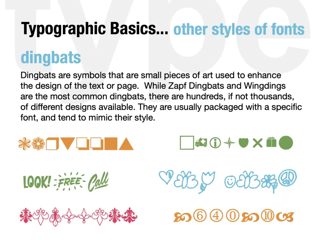
Type Basic
Size and Scale

The Perceived size of a typeface is a function of its x-height as well as its cap height.

These Texts are set in the same point size, but their perceived scale is completely different.
For designers, understanding the psychological impact of fonts is not just about making aesthetically pleasing choices, but about creating meaningful, effective, and emotionally resonant communications. By harnessing the emotive power of typography, designers can craft experiences that truly connect with their audience on a deeper, more visceral level.

Scale is the relationship among elements within a composition or hierarchy.
As we continue to unravel the intricacies of font psychology, we open up new possibilities for more impactful, empathetic, and user-centered design. The future of typography lies not just in its visual appeal, but in its ability to speak to the human psyche, creating experiences that are not only seen but felt.

Scale is the relationship between elements and their context. Here, big type sits on a small page.

Mixing Typeface

Mixing styles within one family is a good place to start.

What are the characteristics of each mode of alignment?
Example using Trilogy Sans ExtraBold Compressed small caps, Medium, Heavy Condensed, Egyptian ExtraBold, Heavy Wide, Bold BoldWide, Fatface Wide.

Example using Trilogy SansWide, Egyptian ExtraBold Wide, Fatface Regular with Swash and alternate forms.

Type crime: These typefaces are from the same family, but they are too close in weight to mix well.
Typography vs. Lettering vs. Calligraphy
Typography, lettering, and calligraphy are often used interchangeably, but they are distinct disciplines with unique applications in design. Understanding their differences and when to use each is essential for mastering visual communication.

A. Key Differences Between Typography, Lettering, and Calligraphy
1. Typography: The Art of Using Pre-Designed Letterforms
Typography refers to the arrangement, selection, and styling of existing typefaces (fonts) to communicate a message effectively. It is used in both print and digital media and relies on fonts created by type designers.
Characteristics of Typography:
- Uses pre-designed typefaces (e.g., Arial, Times New Roman, Helvetica)
- Involves adjusting kerning, tracking, leading, and hierarchy for readability
- Used in branding, websites, books, advertisements, UI/UX design
When to Use Typography:
- Designing logos, websites, brochures, posters, and mobile apps
- Creating body text for readability in books, articles, or reports
- Maintaining consistency in corporate branding and identity
2. Lettering: The Art of Drawing Custom Letterforms
Lettering is the process of drawing letters instead of using pre-existing fonts. Each letter is designed specifically for a particular composition rather than being part of a reusable typeface.
Characteristics of Lettering:
- Every letter is custom-made, giving a unique look
- Often hand-drawn but can be digitized
- Commonly used for logos, murals, and decorative typography
When to Use Lettering:
- Creating a unique, artistic logo (e.g., Coca-Cola’s script logo)
- Custom signage, packaging, or illustrations
- When you want a handcrafted, one-of-a-kind design

3. Calligraphy: The Art of Writing with a Brush or Pen
Calligraphy is the art of beautiful writing using specialized tools like brushes, dip pens, or markers. Unlike typography or lettering, calligraphy is fluid and influenced by the movement of the hand.
Characteristics of Calligraphy:
- Focuses on elegant, expressive strokes and flourishes
- Uses tools like brushes, fountain pens, or traditional calligraphy pens
- Styles vary across cultures (e.g., Gothic, Copperplate, Arabic, Chinese calligraphy)
When to Use Calligraphy:
- Wedding invitations, certificates, and elegant branding
- Handmade greeting cards and artistic lettering projects
- Traditional or cultural designs requiring an authentic handwritten look
B. Typography vs. Lettering vs. Calligraphy: A Quick Comparison
| Feature | Typography | Lettering | Calligraphy |
| Method | Uses pre-existing typefaces | Drawn by hand, digitally or on paper | Written with specialized tools |
| Purpose | Functional, consistent text for readability | Custom, decorative, expressive lettering | Artistic, fluid, expressive writing |
| Examples | Book text, websites, signage | Logo designs, murals, custom titles | Wedding invitations, certificates, artistic scripts |
| Best Used For | Body text, branding, UI/UX | Unique designs, hand-crafted logos | Elegant, traditional, and personal works |


